From SaaS to Regulated Utilities: Lessons Learned Building My First Independent Equity Report
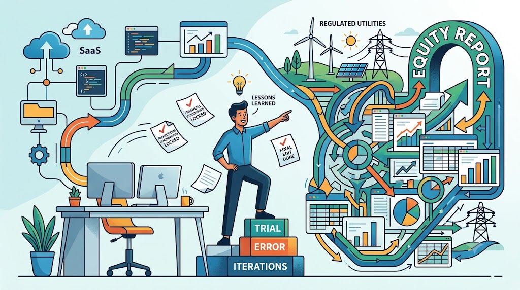
Recently, I completed an independent, full-scale equity research report on a green energy company, NextEra Energy. The process took much longer than I would have liked. Operating without a blueprint meant that every single step was a blank canvas, everything was brand new. It required a steep learning curve of trial, error, and endless iterations. After going back and forth more times than I can count, I finally crossed the finish line.
Looking back, there are three major areas I want to improve in my next project: the construction of the financial statements, the architecture of the projections, and the final editing of the report.
1. Financial Statement Construction: The SaaS vs. Utility Shock
First, mapping the line items from the original financial statements into my own model structure was an incredible time sink. Because my past valuation work focused heavily on the SaaS industry, transitioning to a regulated utility felt like learning a completely different language. The model architectures are fundamentally different. It required a painful process of trial, error, and starting over.
On top of that, retrieving the historical data was tedious and inefficient. There must be an more efficient way of doing so. Moving forward, I have two core focus areas for financial statement construction: how to structure my templates in a clean, actionable layout from day one, and how to source historical data much more efficiently.
2. Projecting the Unknown: Roadmapping the Drivers
Second, when it comes to the architecture of the projections, understanding the unique nature of the business and its industry is everything. Effectively identifying the key drivers for the revenue model is absolutely crucial before you even touch a formula. Moving forward, I realized it’s much better to explicitly roadmap the projection modules—revenue, costs, debt schedules, working capital, and so on—in direct tandem with building the core financial statements, rather than treating them as separate steps.
3. The Visual Layout: Fighting with Page Breaks and Charts
Finally, there was the editing and formatting process, which turned into a massive headache. I tried to finalize the formatting of each section as I went along so I would know where to stop. Big mistake. When I finished the full report and went back to make a few critical content revisions, it completely broke the layout. Page breaks shifted, text blocks misplaced, and the formatting was completely messed up. Lesson learned: next time, the full report text needs to be 100% locked down and finalized before I spend a single second editing the visual layout.
Oh, and I forgot to mention the charts—building those graphics was like catching constant curveballs. Sometimes I would spend two hours just trying to shade a specific area under a curve or fix a data label alignment, only for Excel or my charting tool to stubbornly refuse to work.
Despite the hair-pulling frustration, the data bottlenecks, and the moments of deep self-doubt, I made it. I overcame the execution hurdles, bridged the gap between tech and utility mechanics, and put out a piece of research I am proud of. It was a brutal process, but it made me a significantly better analyst. On to the next one.